 |
 |
 |
Yellow and Orange – Nature and Urban
A few days ago I posted about going with what works. I told of creating a few images for my slider at 3:1 which seemed to work better, be more artistic, than my original image aspect. The point I was making was that we/I shouldn’t feel restricted by arbitrary boundaries simply because they were the conventional norm but be open to what works even if “outside the box.”
Paul Maxim’s much appreciated and thoughtful comment on that particular post included the statement:
“Now, if you want to be truly unconventional, try the reverse aspect ratio (1:3). You know, tall and skinny. I personally don’t think it will work very well, but it will certainly be different!”
Loving a challenge, my brain got cranking and my creative energy flowing. I was curious, how well would 1:3 work for an image?
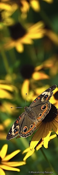
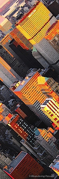
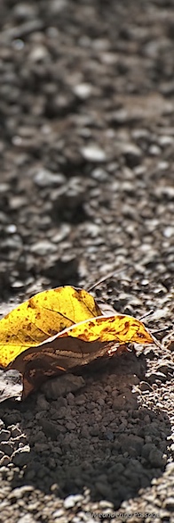
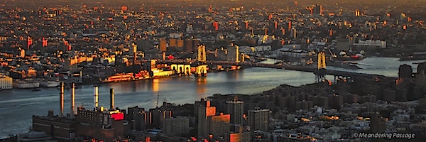
I began with previously published photos, those which seemed to lend themselves to this aspect, created virtual copies in Lightroom and then cropped them at 1:3 — the 3 you see above. I added the bottom 3:1 aspect image for artist balance…I’ve drawn my conclusions, what do you think?
Can/does 1:3 work?
Now it might be say I cheated somewhat by placing the three 1:3 images in a triptych like arrangement. However, you can click on each image separately to see them singularly in a larger size. :-)

An experiment worth doing and one that produced some interesting images. I especially like the one with the butterfly. Nice post.
Don, thanks. Interesting would certainly be one description of these 1:3 crops. :-)
Well, I wouldn’t say that you “cheated”, but you did change things a bit. The overall aspect ratio of the above 4 images is roughly 4.5 x 6.5 (actual size, of course, will depend on your monitor). That’s close to a “standard” 4 x 6 (portrait mode).
Looking at the 1 x 3’s individually is a bit of a trip! I don’t know about anyone else, but my brain struggles with it a little. It’s definitely different. All 3 compositions seem “odd” at that aspect ratio.
Now, if one of them were a lighthouse or a tall building, I think our brain would say, “yes, that fits”. Which kind of gets us into another question. What, if anything, is the relationship between subject matter and the “best” aspect ratio? Are they independent variables or does one determine the other?
I find them at first glance to be a little “odd” myself, Paul, but I’m thinking it may be a case of the brain dealing with something unusual vs. something that doesn’t work…if that makes any sense. They’re certainly not unusable.
There’s probably some type of relationship between subject matter and the “best” aspect ratio but I can’t say what it would be. Certainly only general guidelines with exceptions, not hard and fast rules. :-)
Your photographs are beautiful. I am not sure whether I like the unusual shapes, but I am all for experimenting. Michael E. Gordon recently made an excellent post that contains passages that show a similarity of thinking regarding cropping to what you are talking about. You might be interested in his thought-provoking post and my counter argument in favor of retaining traditional frame shapes: http://michaelegordon.wordpress.com/2011/02/06/camera-less-seeing-and-the-art-of-cropping/
David, thanks and thank-you for the link. I shall certainly follow up on Michael Gordon’s writings on this subject. Not all experiments result in success but most result in valuable lessons taught.
With the exception of the single leaf photo, all of these show very nice composition and are very interesting, especially the middle one of the buildings. I think that the 1×3 is a very convenient size in a certain context. For instance, I have a very narrow wall space between a window and the corner of the wall. The long narrow format is perfect for this space. I’ve used it in the past in for this type of situation and it works.
Ken, thanks and in the situation you describe this aspect would be perfect. It comes back to finding what’s best for each circumstance, image and requirement — finding what works!
They are visually striking and work particularly well with your incredible imagery. They hint at “a larger picture” and personally I find them arresting and enticing. I think it’s a brave thing to experiment with unconventional framing especially as all of you photographic training must have been pulling you in a more conventional direction.
That said, I would say that the proof of the pudding is in the eating – and the presentation of your work on this page is a stunning success, I really love these works.
For more timid photographers (such as myself) I think they might work well as gateways to images framed conventionally. By that I mean, in a digital presentation i.e. website, that the photographer could have the best of both worlds – by clicking on the 1:3 image they’re taken to a “full size” image.
P.s In case I haven’t mentioned it already, I love these images ;)
Martina, I may be going out on a limb here but I believe you like these 1:3 images. ;-) Thank you!
Using them as gateway/lead-in images pointing or linking to full size images sounds like a great way to use them — a bit like what your wonderful website’s homepage of images does now.
I believe you under sale yourself by thinking yourself timid — a timid photographer wouldn’t have so quickly seen the many possibilities.
I like these very much. So many interesting comments have already been made, but put me in the “yes, more, please” group. The mystery, the surprise element, the usefulness that others have mentioned sum up my feelings. I would love to see you do more of these. I have a selfish agenda. Having experimented only the least bit in this area and always having been shy to share them, I am being encouraged by your boldness.
Anita, I can almost certainly say you’ll see more of these as well as perhaps other unique experiments from me. I’ve learn much by opening myself and my work up for others to see and comment upon. I’d encourage you or anyone else to do the same. Thanks you!